
Do you ever feel like you just can’t figure out what colors go with what? Being great at color is clearly a special gift, but we mortals can learn to find our way with a little help. Consciously looking at wonderful combinations of color is a way of training the eye: a practice. And an easy way to start practicing is to visit Studio Horn, color master Eve Ashcraft’s quirky personal blog about “Design, Art, Absurdity, Obscurity, Good Shopping, Farming, Wild Life, Urban Life, Domesticated Animals, Humans, Color, Architecture, Photography, Ideas and Happiness”.
Ashcraft, who has consulted about color for Martha Stewart, Architectural Digest and Benjamin Moore Paints, to name a few, has a regular post theme called “Today’s Color Palette“.
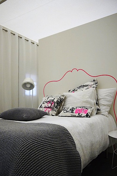
It can include just about anything with a beautiful clusters of colors, like this orange, brown and taupe still-life she composed with stylist Jeffrey Miller…

…or a wall she’s spotted and photographed…

…or a botanical illustration…

or a bowl of tomatoes…

Brilliant Surfaces, Ashcraft’s website of her custom surfaces for photography, has lots of ideas and examples of ways to paint and stain woods and other surfaces that could be translated (with some trial-and-error) into a home-improvement or d-i-y idea. Check out Brilliant Inventory. (Her site also has a terrific, quirky map of where to find the coolest stuff around Soho in Manhattan.)
Ashcraft is writing a book called Color 101. Stay tuned.
thank you for sharing her site with us, I just love it. damn, your blog makes me so damn happy. glad you exist!