
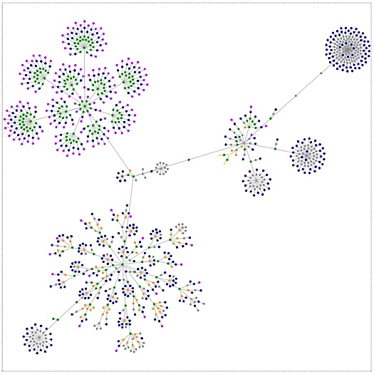
If you go to Webpages as Graphs, you can type in the URL of any website and see it slowly plotted as a graph, in a kind of magical animation. We did it with ‘the improvised life’ and watched in astonishment at the graphing of its nine months of life: it “blossomed” into what looks like a strange flower, bud by bud, one slowly emerging from another, like watching a time-lapse nature video. We remembered when this blog was only an idea, and the unfolding graph reminded us of the step-by-step process (full of doubts and blindness, setbacks and zig-zags), one thing leading to another, that got us HERE, where we are right now, and all the people we are connected to.
We graphed the New York Times’, and a couple of other websites, just to see if there was any real difference. And there is. Each site made its own unique pattern and vibe: each the product of many forces. This is ‘the improvised life’s. Amazing.
Related post: Video Meditation: A Year in 2 Minutes (or Even 40 Secs)



This is a very cool site, but when I tried it with my own blog, my computer eventually froze up and I had to shut it down. I’m not sure what that might mean…
I don’t know what the problem might e. Did you try it after you had rebooted? or with a different browser? It is really so thrilling to see…
Wow this is a great resource.. I’m enjoying it.. good article