When we scroll through the many design sites we cull for ideas, we find ourselves wading through image after image of the same midcentury-esque spaces, void of anything that “breaks” the look. There’s a disconcertingly uptight sameness to the essential idea of mid-century design that was, in its time, so alive and quirky.
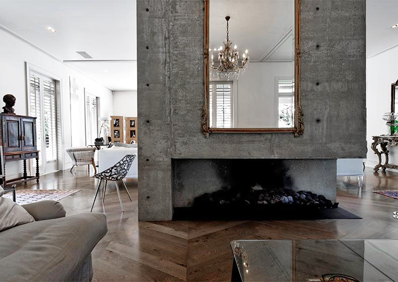
So we found ourselves curiously relieved when we came across this very modern, in parts brutalist, space whose design was broken and softened by classical antiques. The heavy concrete mantle with an ornate gilded mirror is a fine example.A mashup of moderne and classical elements is nothing new, but we found this to be an interesting example, since the classical and modernist elements are both so extreme.
We weren’t crazy about the fussy old-fashioned and curiously uninteresting chandeliers that festoons the place, and which you can see reflected in the mantle mirror. So…
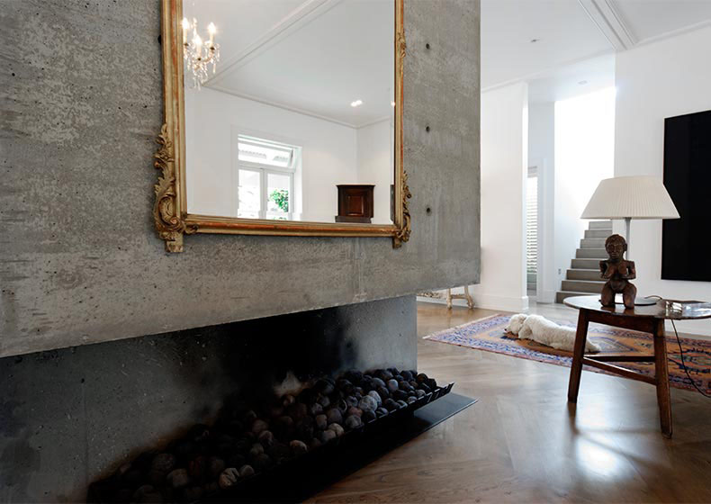
…we thought we’d see what it would look like without it and roughly photoshopped it out JUST TO SEE.
It’s a lesson how the shift of a single detail and radically alter the vibe and feel of a space.
Which do you like better?
Check out more images of the space at Desire to Inspire.


I prefer it without, they are to fussy.