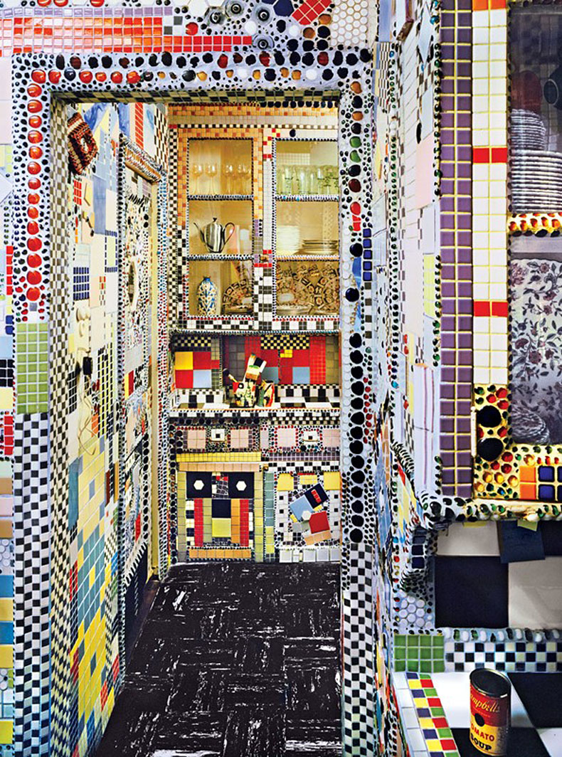
In the annals of kitchen design, art collector/dealer Holly Soloman‘s has to be one of the most out-there. The dazzling, mind-boggling riot of colored mosaic was created artist Dorren Gallo as an on-site installation in the eighties. Solomon said to the New York Times in 1984, “I don’t know how to find an egg in it. But for me…
Read MoreDIY Beautifully Chalky Limewashed Walls
When friends renovated their NYC brownstone, they made wonderfully varied walls — high-gloss painted walls next to beautiful flat, chalky ones achieved by careful plastering — that made the rooms incredibly beautiful.
I copied their high-gloss walls in my Harlem space, but wondered how I could achieve the chalky effect of plaster myself. The answer recently presented itself in a great DIY by Justine Hand for Remodelista.
Read MoreVicarious Home Building: Blu Home’s Breezehouse
Want to see a very cool house appear before your very eyes? Watch as the Blu Home‘s team delivers, sets, and unfolds a prefab Breezehouse in one day, making it watertight before the impending rain. (Video link here.)
Read MoreCut Out Geometries in Walls and Cabinets
We love this detail from a home designed by i29 Interior Architects: a spray of cut-outs in a wall of cabinetry. It breaks up the uniformity of the cabinets in a random, rather artful way. It applies a technique we love — unexpected holes cut out of walls — to cabinets.
Read MoreTransforming Wall Bed-Bookshelf-Storage Unit
Last May I posted the life-size prototype I made out of FoamCore to help me design a complex combination of berth-style (sideways) wall bed, storage and bookshelves for my space in Harlem. I had been struggling with the design problem for some time: how to make the massive volume of the wall-bed blend into the structure, so you…
Read MoreFab Color-Tinted Plywood
As fans of plywood for its economical, elemental, very modern possibilities for stylish interiors, we are smitten with bright blue-stained plywood used in Vancouver’s Kin Kao Restaurant. Local Scott & Scott Architects choose plywood to use in tandem with readily available materials, including painted concrete, soaped beech, and galvanized metal. Their clever technique of using construction-grade…
Read MoreCalder-esque Improvised Olive Fork
Looking through our photo archive of the Laboratory renovation, we came across this image of an olive fork improvised by Roberto, a stunningly-outside-the-box-creative of a carpenter who was part the construction team. Being Portuguese, he loved olives and bought a jar for his lunch one day. Having no fork with which to spear them, he…made one…
Read MoreLe Corbusier’s Wall Built Tight-to-The Window, and Ours
This image of a room in Villa Savoye, the Le Corbusier-designed modernist villa in the outskirts of Paris, defies notions we had previously held about the WRONGNESS of having a wall run right into a window. That is what we encountered when we bought our laboratory space; we saw it as a major design flaw,…
Read MorePainted Oriented Strand Board Floors
Remodelista recently featured the clever redesign of a 430-square foot-apartment in a century-old row house in Antwerp, the work of Belgian architecture firm Komaan! —translation, “Come on!” It’s full of good ideas, including clever layout that creates a fluid space with lots of storage, and interesting use of plywood, but our favorite is the floors: sheets of…
Read MoreReorganization as Soul Cleanse
A 48-hour disappearance into the depths of my studio was finally interrupted late yesterday by a well-meaning friend. He peered in to find me on hands and knees wiping out the lowest shelves with damp paper towels. “Jeez. Still at it?” I swiveled and growled like a rabid dog, sweat pouring down, hair plastered, eyes raccooned…
Read MoreWhy Not Really WIDE Moldings?
Found on the great Aqqindex, which almost fetishizes design from the 70’s and 80’s: a vew of Ettore Sottsass and Aldo Cibic’s design of the Munari Apartment, from 1983. Dig thos wide, spare moulding around the door, the opposite in moderne uber-minimalist, and very exprensive none-at all moldings. Rather then the usual 2-inch wide compromise,…
Read MoreApartment Reno Encompasses Old and New
Recently we wrote about a slick renovation that sadly covered over a beautiful aged wall that would have made a wonderful addition. Since then, we found an interesting mix of marriage of old and new details by architect Karin Matz in a cost-conscious renovation of a Stockholm space that had been used as furniture storage for 30 years.…
Read MoreAnnals of Bad Design: Ill-Considered Sofa Placement
We are stunned by the really ill-considered design of this slickly-renovated home (house tour here). The sofa is placed AWAY from the garden view and facing a wall unit!! A simple fix would change the whole flow of the room (you can really see it in the floor plan, below)…
Read MoreWatercolor Wall(paper)
Lately, we’ve been seeing some appealing images of watercolor walls. Hmmm. Nice. Of course we thought, we’ll do that ourself. Easier said than done. From our limited knowledge of it, the beauty of watercolor has much to do with the paper, which allows the paint to bleed in interesting ways. So we started hunting for solutions.
Read MoreRenovation Danger: Covering Rough, Beautiful Details
Recently, we came across a house tour of a highly renovated apartment in Madrid. It included one “before” picture that made our heart sink: OMG, we thought, look what they covered up! During the demolition, a beautifully textured wall was revealed.
Read MoreCreative’s Well-Equipped Bathrooms
We’ve long admired this rather visionary bathroom of some friends. They planned their bathroom to accommodate what most bathrooms do in an ad hoc way: house reading material and intellectual pursuits. That got us checking out other iterations of this idea.
Read MoreCeiling Lights Placed Randomly, Like Stars
Early on in planning the Laboratory renovation, we started thinking of ceiling lights. Since the ceiling was only eight-feet-high, we were trying everything we could to give the illusion that they were higher, achieved mostly by replacing the squat doors with tall ones that created floor-to-ceiling vertical lines that made the ceilings appear higher. In…
Read MoreDIY Silverware Drainer + Dish Drainer Hack
When we renovated the Laboratory, moving and installing our 25-year-old kitchen cabinets for the 3rd time, we indulged our minor obsession in the realm of dish drying accoutrements, hacking and customizing at will.
Read MoreEverything Painted One Color, Moldings and All
We came across another good idea from the portfolio of journalist and photographer Amandine & Jules that seems to be something of a trend: NOT painting moldings and doors a separate color but rather the same color as the walls, to make a uniform, less busy and, depending on the color, more contemporary look.
Read MoreTrending at the Int’l Furniture Show: Faux Distressed Surfaces
Designer Laura Handler, whose Montana home we featured a while back, sent us a report of her vist to ICFF, the yearly International Contemporary Furniture Fair in New York City. Here’s the trend she spotted and her funny and insightful commentary : I did notice an interesting phenomenon. There seemed to be a growing trend of faux distressed…
Read More